Kimball Jenkins
Kimball Jenkins is a historic community cultural center in downtown Concord, NH, listed on the National Register of Historic Places. Celebrating 40 years of fostering local community bonds through art, history, and culture, the center prioritizes diversity, inclusivity, and collaboration. It plays a vital role as a cultural and economic hub for artists and regional events.

Objective
Our objective for Kimball Jenkins was to develop a user-friendly website that not only draws in new visitors but also enhances the convenience and usability for existing users.
This approach aims to create an inclusive online platform that caters to the diverse needs of the community, fostering engagement, and accessibility for all.
Role
Lead UX/UI designer
Project duration
16 weeks
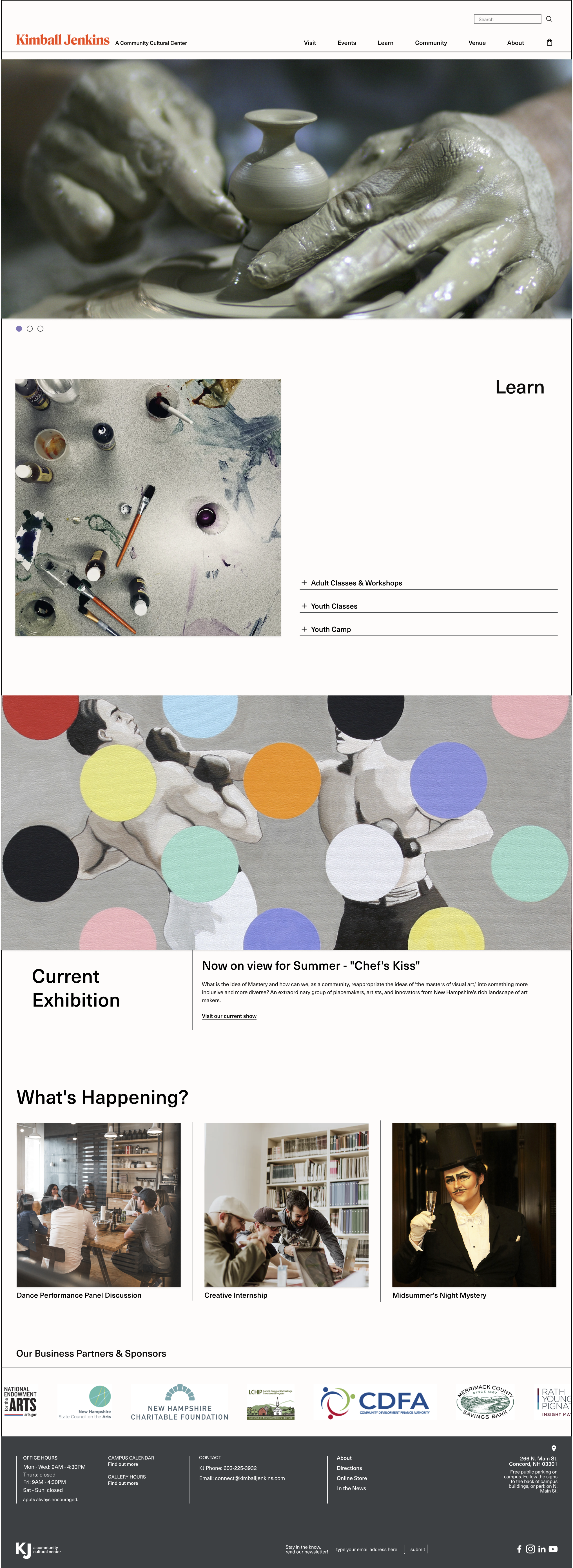

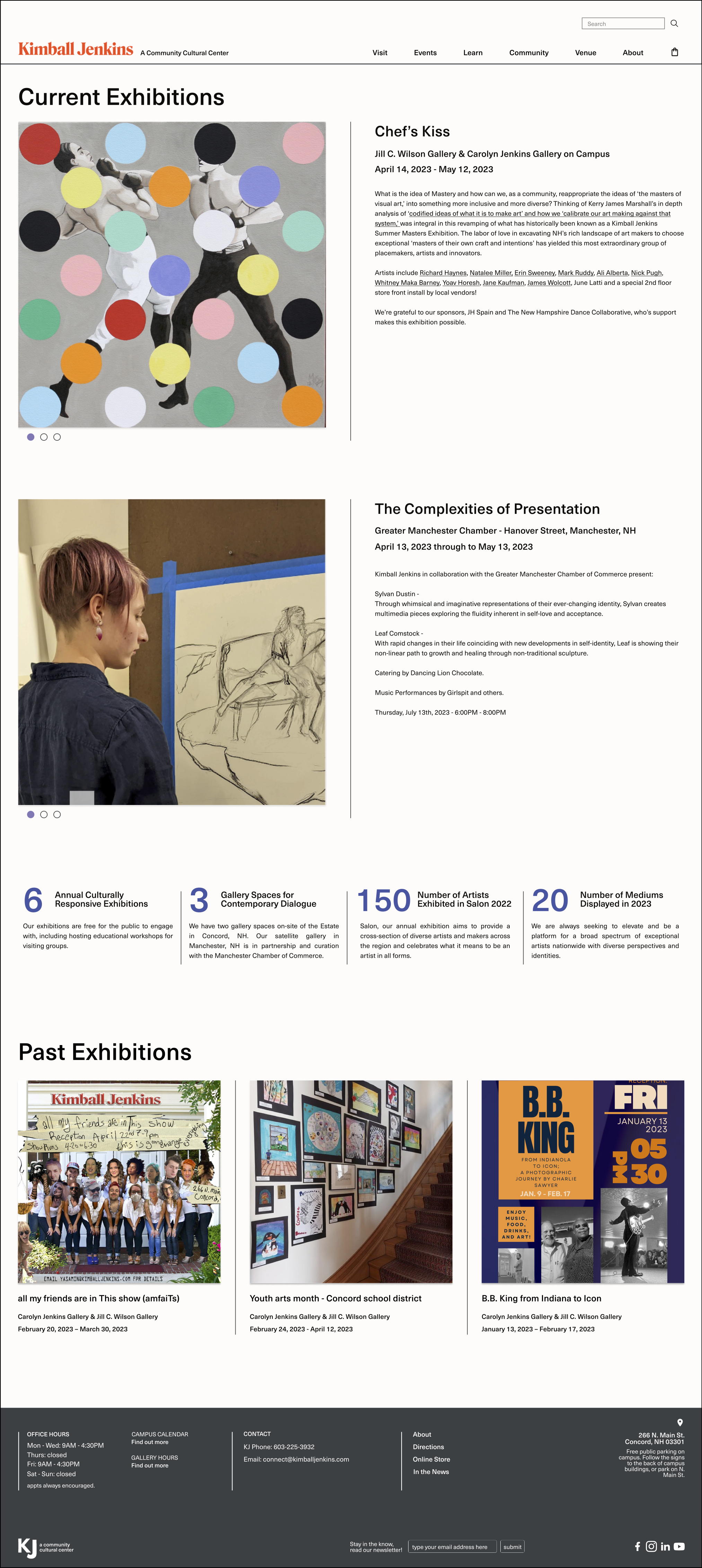
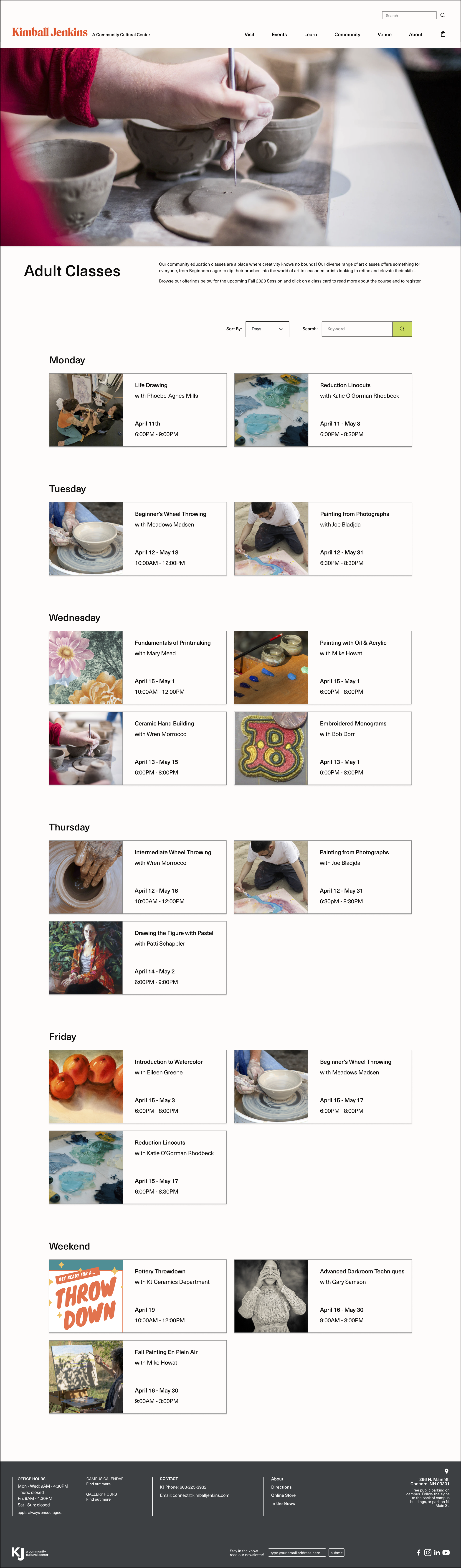

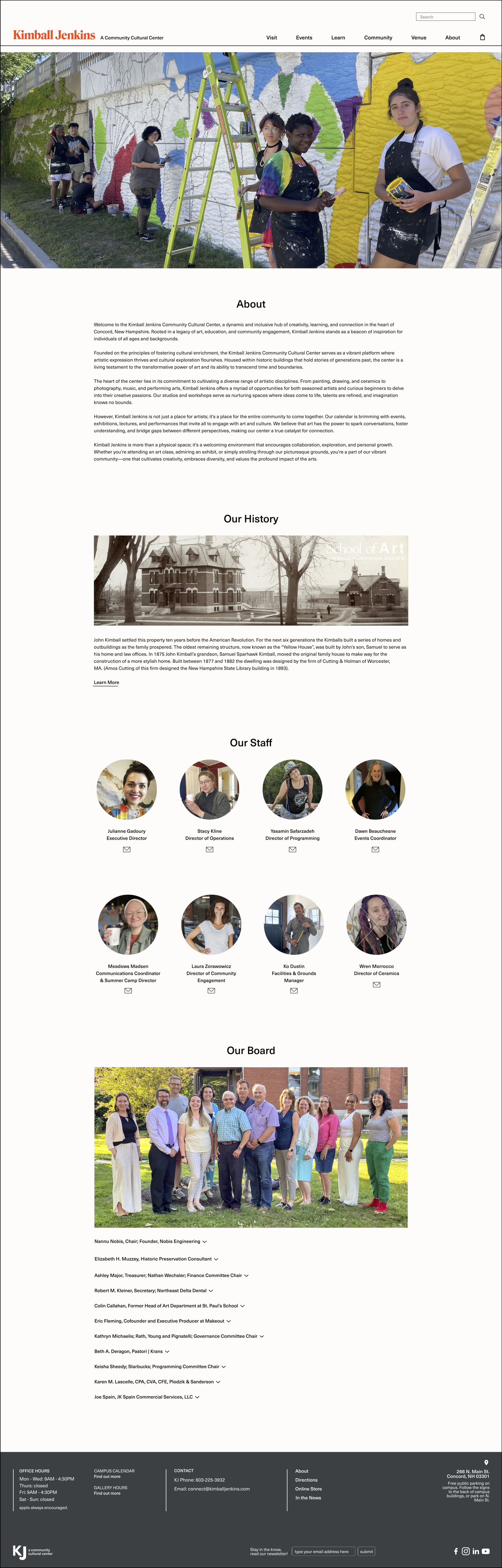
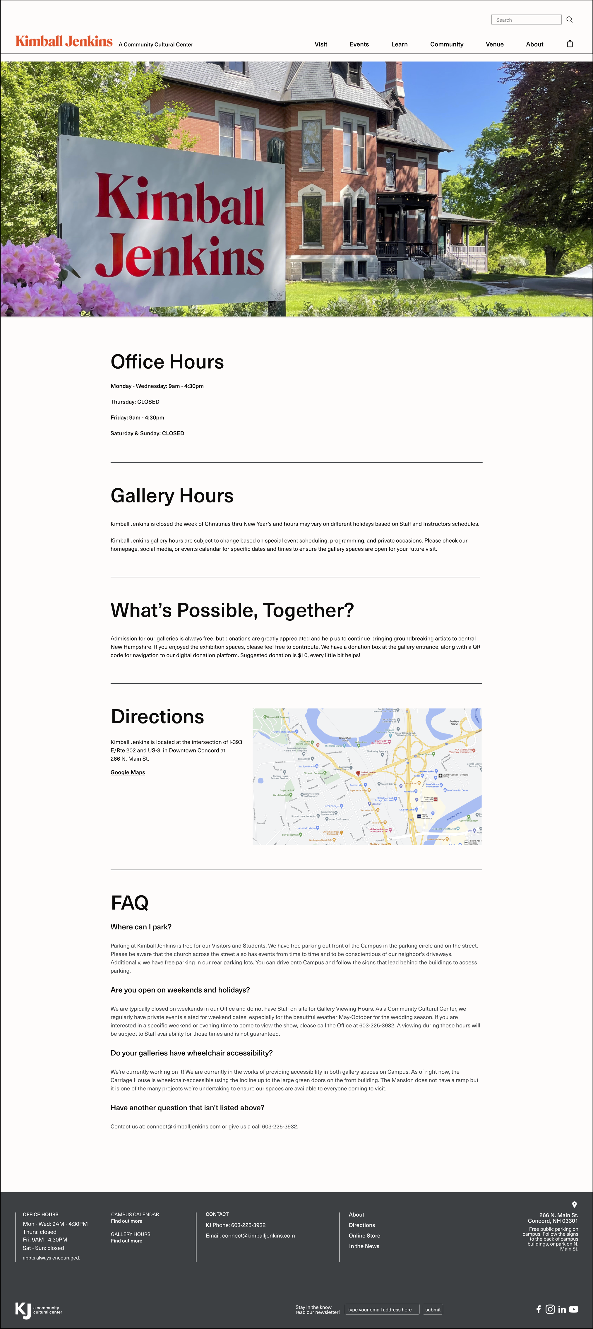
Design process

Initial research
Competitor analysis takeaway
-
The design should always keep users informed about what is going on, through appropriate feedback within a reasonable amount of time.
-
The design should speak the users' language. Use words, phrases, and concepts familiar to the user, rather than internal jargon. Follow real-world conventions, making information appear in a natural and logical order.
-
Users often perform actions by mistake. They need a clearly marked "emergency exit" to leave the unwanted action without having to go through an extended process. When it's easy for people to back out of a process or undo an action, it fosters a sense of freedom and confidence. Exits allow users to remain in control of the system and avoid getting stuck and feeling frustrated.
-
Users should not have to wonder whether different words, situations, or actions mean the same thing. Follow platform and industry conventions.
-
Good error messages are important, but the best designs carefully prevent problems from occurring in the first place. Either eliminate error-prone conditions, or check for them and present users with a confirmation option before they commit to the action.
-
Minimize the user's memory load by making elements, actions, and options visible. The user should not have to remember information from one part of the interface to another. Information required to use the design (e.g. field labels or menu items) should be visible or easily retrievable when needed.
-
Shortcuts — hidden from novice users — may speed up the interaction for the expert user so that the design can cater to both inexperienced and experienced users. Allow users to tailor frequent actions.
-
Interfaces should not contain information that is irrelevant or rarely needed. Every extra unit of information on an interface competes with the relevant units of information and diminishes their relative visibility.
Summary
After evaluating direct and indirect competitors we’ve gathered useful insights to reference back to while designing such as having consistency and standards, making sure our design conveys a narrative and evokes emotion in a visual way and having a balance of visual and text elements. We also needed to create a UI and asset library for consistent color, type, icons, and navigation elements to promote recognition and learnability of our product. Another important factor was the information architecture. We wanted to build a good framework and structure of our product to assist users in accomplishing their goals. This creates connection in the user (the person looking for information), the content, and the context (where the information lives).
User research
We conducted user interviews as well as surveys in order to get to know our users better. We wanted to know what the users’ main goal was when going on the website and what challenges they faced in order to define what we needed to solve for.
Some of the challenges that needed to be addressed were the difficulty of finding information, visual hierarchy, the structure of the calendar, and overall organization.
We also found that 47% of the users were on the website for adult class offerings, 29% for upcoming exhibitions and events, 10% for summer camp information, 6% for Kimball Jenkins’ history and historical preservation, 2% for the about page, 2% for class supply purchase, 2% for youth programming opportunities, and another 2% for donations.
Users go on Kimball Jenkins’ Website for…

Sally
“I can’t always sign up and pay for the classes I want (online).”

“There's a lot of info and it's organized in ways I'm not expecting.”
Sara

Quincy
“It takes too many clicks to get to places.”

Katie
“I do not find the site user friendly. A clearer navigation system would be easier to use.”

Problem statement
The current website for the non-profit community cultural center is difficult to navigate and does not provide a user-friendly experience for visitors. Users have trouble finding information about upcoming events, classes, and programs. Additionally, the website does not effectively showcase the organization's mission and impact in the community. As a result, users are less likely to engage with the organization, sign up for Annual Memberships, and contribute to its overall mission.
Design principles
Consistency. The digital footprint should be consistent in terms of design, layout, and navigation. This will help users feel familiar with the website and make it easier to use.
Make Things Simple and Intuitive. The website should be simple and easy to use. Users should be able to find the information they need quickly and without confusion.
Design for Differences. The website should be accessible to all users, including those with disabilities. This involves designing the website with accessibility features in mind where necessary such as universal font sizing, accessible color contrast, etc.
Visual Hierarchy. The website should have a clear visual hierarchy, with important information being displayed prominently and less important information being displayed less prominently.
Clarity. The website should be clear and easy to understand. Users should be able to quickly understand what the website is about and what information is available.
User journey map


Site map
One of the ways to solve for the users’ challenge of finding information was to restructure the information architecture.
We first made a site map of Kimball Jenkins’ existing website in order to understand where everything lives.

Then we made a new site map. We changed the navigation menu, renamed some cards, deleted ones that weren’t necessary, and reorganized everything.

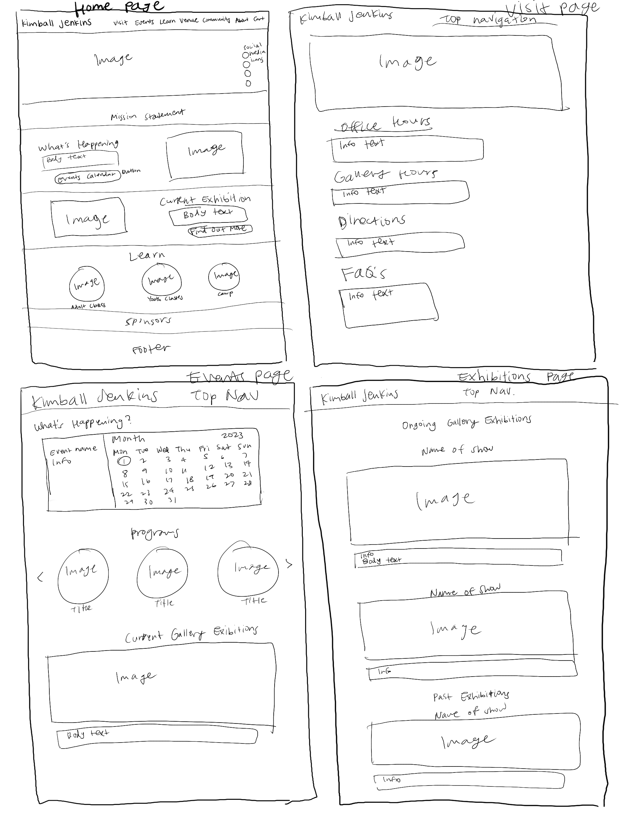
Concept sketches
We started ideating and put our ideas onto paper. These were the final sketches that we started developing into our mid-fidelity prototype.

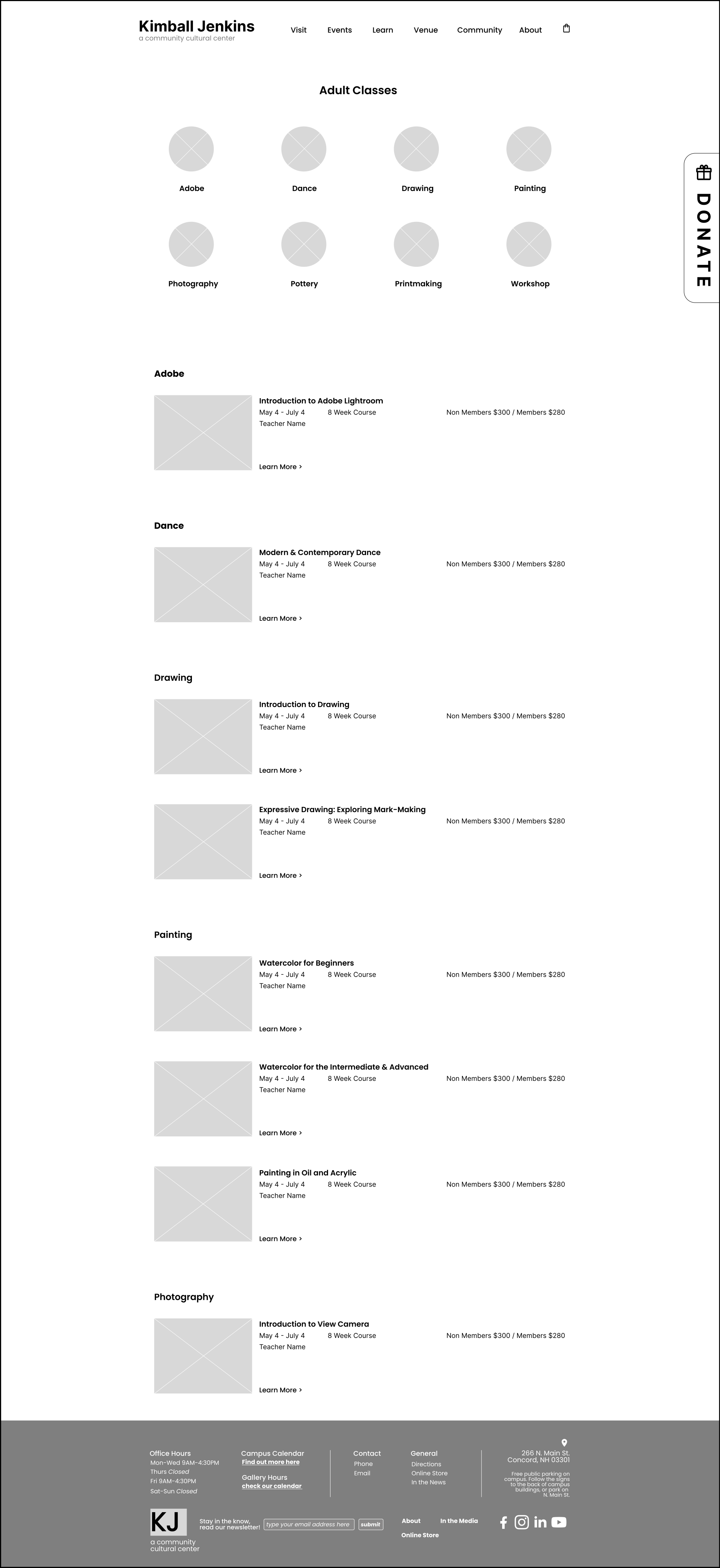
Mid-fidelity prototype




User testing analysis
My team and I conducted user testings of the mid-fi prototype for feedback.
Below are what we identified that needed to be iterated on:
The order of the navigation menu categories—have the Venue tab and Community tab switched so that Learn and Community are together because they are more related to one another.
Change the order of the drop down menu categories under Community—have Membership be first on the list then Donate so that donating doesn’t feel so pushed onto visitors.
Have “Workshops” be under the category of the subject instead of having a separate section for workshops only.
Include class capacity details and how many spots are left
Include Visit link in footer
Overall we received many positive feedback:
Website feels intuitive and that the layout makes sense.
There’s easy access to all the information people would want to see right away on the landing page and
likes simplicity of the design and the usage of graphics.
“I would say this is a 99% home run”
Style tile
For visual design, we wanted to create a modern and sophisticated style that aligns with current design trends and appeals to a wide audience

