Penumbra UX Design
Penumbra is a local plant and lifestyle goods shop in New Hampshire. It has recently expanded the business and opened a second location. Their primary products are plants and carry a variety of lifestyle goods ranging from stationaries to kitchenware and accessories. With the expansion of its business, Penumbra also wishes to have a more meaningful online presence to reach a wider range of consumers.
Project duration
16 weeks
Role
Lead UX/UI designer
Tools
Figma
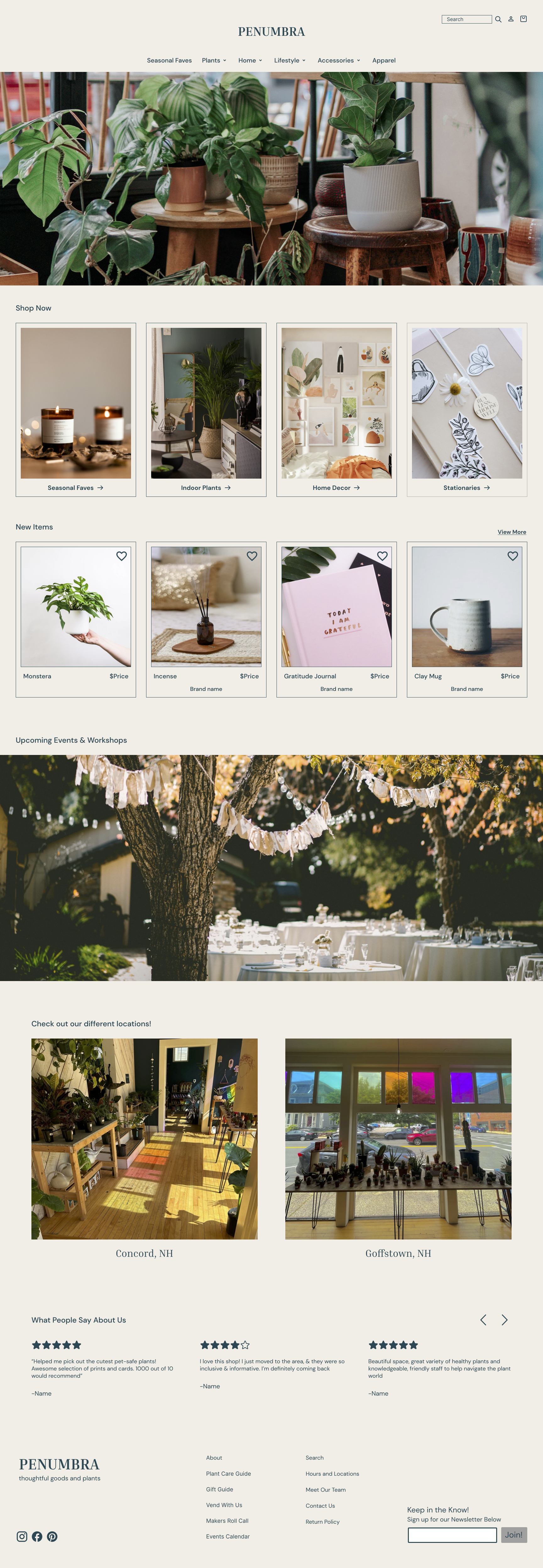
To enhance the online user experience, fostering a sense of ease, accessibility, and care for those engaging with the brand digitally. The primary goal is to make the website a continual source of revenue while authentically reflecting the shop's essence. This involves an expansion into dry goods, ensuring a seamless and recognizable connection between the physical and virtual spaces.
Objective


Initial research
Competitor analysis
-
Strengths
Clean ux design with convenient features like side scroll bar to easily browse through the many products offered.
Top nav bar is clear.
Landing page has sections that make sense that consumers would gravitate towards.
Personalization of the brand with videos of the behind the scenes of the manufacturing process and images of real workers of the brand
Increasing brand trustworthiness with a review section on the landing page as well as a section where customers have shared their own pictures on social media.
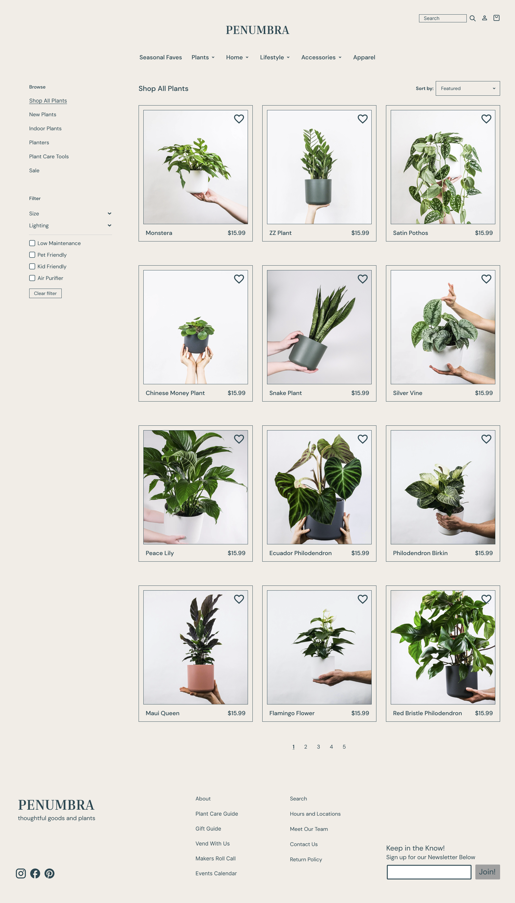
Filters are very convenient and useful like the variety in sizes (xs-xxl), pet friendliness, air cleaning options, levels of difficulty, indoor lighting plants, etc
Offers pots with the plants with color options
Offering consumers help with taking care of their plants by chatting with them
The photography of the plants are in consistent theme and background
Guarantees if plants die within 30 days of arrival they offer a free replacement
Weaknesses
Lacks a bit of character in visual design
Price range is higher (probably due to them coming with pots as well)
-
Strengths
Top nav has accessibility option, which makes it easier for users to read and change certain fonts to another color
Pop up quiz to filter what is best for the user first opens up once home page is accessed (how much experience with plants, how much light, home decor style, pets & children)
States the size of each plant
Can choose plants varying from size, light, air purifying, safe for pet plants, best plants for offices, gifts, etc
Featured Collections help choose between Easy-Care Indoor Plants, Extra Large Indoor Plants and Air-Purifying Plants
Certified Greenery - shows where the plants are grown from
Provides personalized plant support from Plant Doctor and info on services
Personal reviews from actual customers showing various locations of where customers purchased
Custom plants can be ordered via phone or email
Filter options include: Light (how much light is in the house), Size of plant, Pot Options (pot size and style), Pet Safe toggle button, In-Stock Only toggle, sort items by Recommended, Low price, High price, Alphabetically
Weaknesses
Plain visual design
Can get lost while navigating through website
Doesn’t have a strong brand identity that shows through visually
-
Strengths
Hero image on landing page fills the browser, is a bright and inviting vantage point of the shop that makes visitor feel like they’re actually there.
Navigation has several points to encourage shoppers to begin their journey. Hamburger menu, Shop now! Button, and also an attractive category grid on-scroll below the hero image.
Products show low stock warning or ‘1 left!’ warning on different products.
Detailed product descriptions on singular products.
Checkout process has a very industry-standard interface. Has ‘Ship’ or ‘Pick up’ radio buttons at the top first and foremost. Easy to checkout, fast, and intuitive by using the heuristic standard.
Weaknesses
No filtering options available for search.
Some photos are in lower lighting. Images are all different dimensions.
On a lot of the planters, there are multiple options of sizing and no background or reference to help people understand the size.
-
Strengths
Review section on landing page which increases brand trustworthiness.
Has a category dedicated to beginner plants.
Has many different categories of plants.
Weaknesses
Navigation menu has too many options to choose from without hierarchy.
First navigation option ‘Shop’ has 4 main sections, 3 of which all just lead to the home page.
Houseplants section landing hero page is bare and not impactful.
For UPS next day shipping, it is purchased as an item instead of choosing as an option at the checkout page
Guide to take care of plants are hidden in ‘The Club’ tab and not easily found.
-
Strengths
Clear and descriptive main divisions - Plants, Planters, Apothecary, Jewelry, Vintage Apparel, Home, Modern.
Friendly and attractive image and description of who The Shudio is/what they do.
Great photography up close of the items, especially the plants are well-lit and held by a hand for size reference.
Product description for plants shows sunlight needed and watering needs (very cute with emojis).
Options for payments are great (Shop, G Pay, Paypal, Meta Pay).
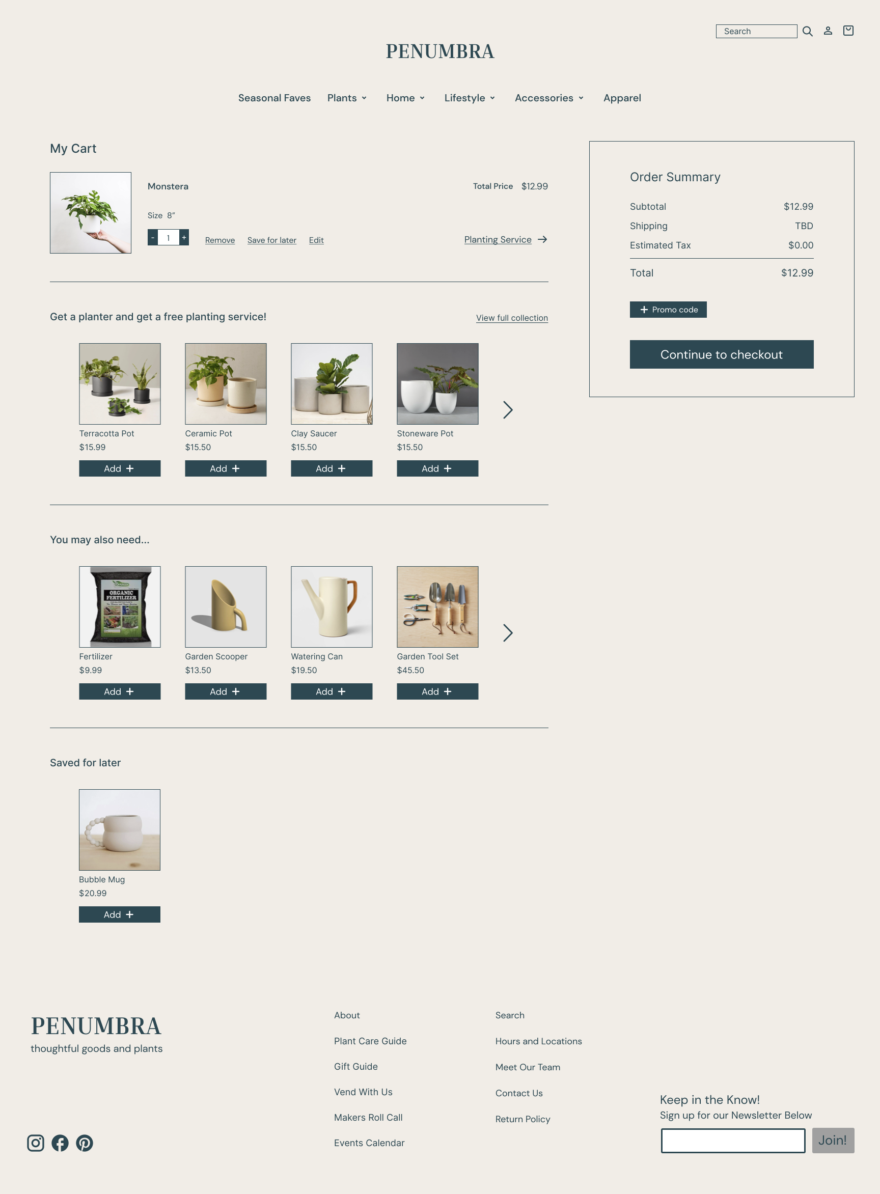
‘You Might Also Like’ add-on option at the bottom is a good feature.
Weaknesses
Top navigation menu is not in all one line. ‘Modern’ is a bit of a strange floater on the second line.
Pill button does not have much contrast in CTA text or on-hover which makes it a little confusing for clicking.
Does not annotate a photo with what size of plant/pot is being held by the person’s hand in the photo. Unsure about which size I’m looking at (many plants have multiple size options).
Pick-up service is the only option available on a lot of items. If shipping is available, the State/Zip code selection is way under options for payment in a horizontal configuration.
User interview discoveries
Users like a minimal design that is aesthetically pleasing to the eye. They consider visual design an important factor of what attracts them and makes them feel a website to be trustworthy.
When it comes to executing a purchase decision, trustworthiness is very important. Things like contact info of the company, real customer reviews, and risk free returns all help gain users' trust.
Users want an easy to navigate site for browsing and searching.
Users want product information to help decide on purchases. For plants, they need care instructions, origin, growth conditions, fertilization, maintenance level, size, humidity, type of sunlight exposure, etc. For dry goods they want size/dimensions, materials, where it's made, etc.
Our users

“Being in person allows me to quality check prior purchasing, unless I know it is a reputable brand/company online”


“I think it’s really helpful to provide information on the specific care each plant needs to thrive.”

“Having more openly queer spaces and businesses in New Hampshire as a whole made us feel more open to the idea of leaving Boston and building our life here together”
Problem statements
Poor navigation and search functionality on an e-commerce website lead to user frustration and reduce engagement on the user’s end.
Inadequate product information and unclear visuals on an e-commerce site cause uncertainty and obstructs informed decision-making among users during the shopping process.
Complex and time-consuming account registration processes deter potential customers from completing purchases on an e-commerce platform.
Inconsistent and unclear pricing information across product listings leads to user mistrust and impacts their willingness to make a purchase on an e-commerce website.
Limited payment options and inadequate security measures during online transactions result in user concerns about data privacy and payment security on an e-commerce site.
Insufficient mobile responsiveness and usability issues on an e-commerce platform create a suboptimal shopping experience for users accessing the site via mobile devices.
Design principles
Usability
Ensure that the website is easy to use, with clear navigation and intuitive search functionality. Users should be able to find products effortlessly.
Clarity
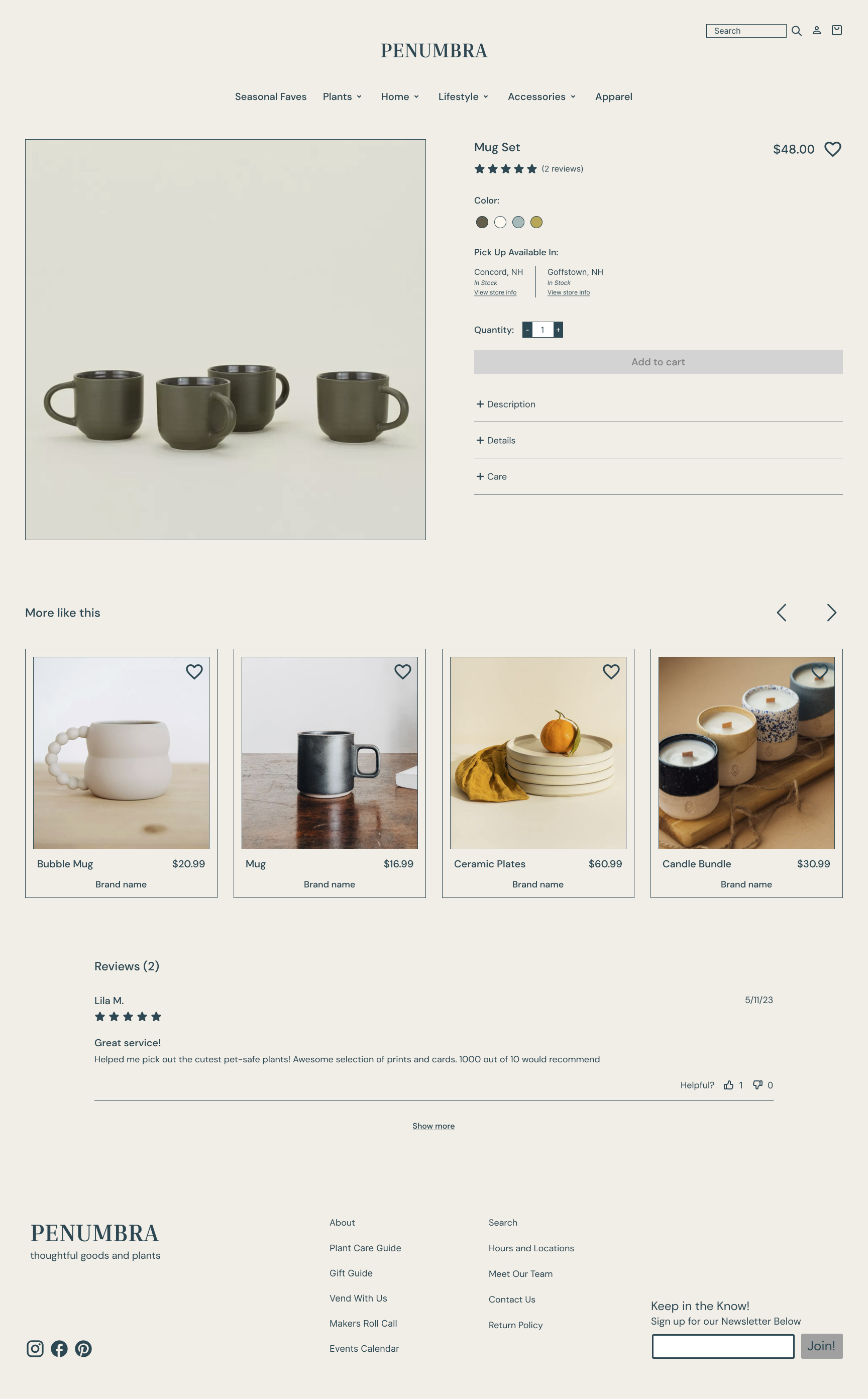
Provide clear and comprehensive product information, including high-quality visuals, detailed descriptions, and customer reviews to assist users in making informed decisions.
Personalization
Implement personalized product recommendations and content to engage users and enhance their shopping experience.
Simplicity
Streamline the account registration process to make it quick and hassle-free for users, reducing barriers to conversion.
Consistency
Maintain consistent and transparent pricing information across product listings to build trust with users.
Responsiveness
Ensure mobile responsiveness and usability, making it easy for users to shop on various devices, particularly mobile phones.
Accessibility
Prioritize accessibility features to ensure inclusivity for all.
Journey map


User test analysis
Challenges Identified
Navigation complexity
User feedback: Some users found it challenging to navigate through the various plant categories.
Solution: Implement a streamlined navigation system with clear categories and filters for a more intuitive browsing experience.
Checkout process length
User feedback: A few participants expressed concerns about the length of the checkout process.
Solution: Optimize the checkout flow by minimizing steps and providing a progress indicator to enhance user transparency.
Positive feedback
Visually appealing design
User feedback: Many participants appreciated the visually appealing layout and use of imagery, creating a pleasant shopping experience.
Easy to navigate and user friendly
User feedback: Overall easy to navigate throughout the website and feels very intuitive.
Suggestions
Interactive plant care resources:
User feedback: Users proposed incorporating interactive plant care resources, such as tutorial videos and community forums.
Consideration: Integrate multimedia resources and community-driven content to provide a more engaging and informative platform for plant enthusiasts. Also include a way to communicate for direct help on plant care needs.